Thursday, October 11, 2012

Graphic Design 2: Magazine Cover and Spread

The purpose of the following assignment was to create a magazine cover and two page spread for an existing design magazine.  I chose to work with Photoshop User magazine.  The content of the spread and the focus of the cover I designed were the results I achieved from Photoshop tutorials I completed from Smashing Magazine. 

I began the project by purchasing Photoshop User magazine and examining the format and structure of the cover and inside spreads.  I then completed two Photoshop tutorials from Smashing Magazine.  The first tutorial gave step-by-step instructions on how to replace the sky in a photograph.  For this tutorial, I started with the following two pictures:


I followed the tutorial, and when I replaced the sky in the original photograph, this was the result:


I also completed a second tutorial that gave step-by-step instructions on creating a burst of light effect surrounding text in Photoshop.  This was the final result:


I chose to use the burst of light effect for my cover of Photoshop User magazine.  For the inside spread, I used screen shots I created when I followed the step-by-step tutorial instructions.  However, before designing my cover and two page spread on the computer, I created several thumbnail sketches.  There was not a lot of variation in the sketches since I was following the existing format and structure used in Photoshop User magazine.


After selecting my favorite layout, I then created the cover and two page spread in InDesign.


Monday, October 8, 2012

Graphic Design 2: Travel Brochure

I designed an eight page travel brochure for the city of Paris, France.  I began this project by researching Paris on the internet.  I also gathered pictures of Paris from public domain websites and purchased pictures from Shutterstock.com.  Since this brochure was created for a class project, I designed the brochure for a fictitious travel agency I named EuroVision Travel.

After my research, I created several thumbnail sketches of possible design layouts for the travel brochure.


After choosing a layout from the thumbnail sketches, I then used InDesign to create the final brochure.  Below I've included the front and back cover along with the first spread of the brochure.


Saturday, October 6, 2012

Graphic Design 2: Four Page Menu

After I designed logo possibilities for Hibachi Grill (see post below), I sketched designs for the actual four page menu.


I then chose what I felt were two of the best menu and logo designs and created them using InDesign.  In the first design option below, my goal was to create a menu with a sleek, modern, minimal feel to it.  In the second option, I used oriental style lettering and an oriental style motif/symbol.  In both designs, I chose colors that are associated with oriental culture.


Graphic Design 2: Logo Designs for Menu

The next assignment was to create a four page menu for a restaurant.  I chose to create a menu for Hibachi Grill, a restaurant serving Chinese and Japanese cuisine.  Before creating the menu, I designed a logo for the restaurant.  I sketched out several options for the logo.


After drawing my sketches, I created various logos using Illustrator.  On the first page of options below, I created a logo using oriental style fonts.  For the second page of options, I created my own font inspired by the shape of chopsticks.  On the last page of options, I combined chopsticks with Optima and Futura (condensed) typefaces.


Sunday, September 30, 2012

Graphic Design 2: Two Page Typography Spread

The purpose of this assignment was to create a two page spread about typography using InDesign.  The text used in this spread was taken from a PowerPoint presentation from class regarding the subject of typography. 

I created several thumbnail sketches of possible designs I could use for this project. 


I then selected two of my favorite layouts to use in my computer designs.  In the second layout, I completed two different versions (see spreads two and three below).  In the first version, I scanned a newspaper and placed that behind the word "Typography".  In the second version, I changed the color and did not use the scanned newspaper print.


Wednesday, September 12, 2012

Graphic Design 2: Homage Poster

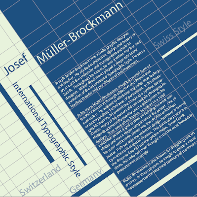
The assignment for this project was to create a poster paying homage to a particular designer.  I chose Josef Müller-Brockmann, a Swiss graphic designer who played a major role in the evolution of the International Typographic Style.

I began this assignment by studying his posters and researching his design style.  I found that his goal was to create graphic expression through objective and impersonal expression.  He wanted to eliminate subjective feelings and propagandistic techniques of persuasion and often used a grid system in his designs.  The grids were often hidden.  However, in a 1980 exhibition poster (see below), a grid system underlying his work was visible and was a major element of the poster.

One of his most well known pieces was the der Film exhibition poster (see below).  He used mathematical spatial division to achieve harmony of design.


Müller-Brockmann was also known for designing concert posters (see below).  In these posters, his idea was to create a visual counterpart to the structural harmony of the music.


After researching Josef Müller-Brockmann's posters and design style, I created thumbnail sketches of my own designs emulating his style. 


I then created four designs on the computer emulating and paying homage to Josef Müller-Brockmann.