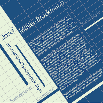
I began this assignment by studying his posters and researching his design style. I found that his goal was to create graphic expression through objective and impersonal expression. He wanted to eliminate subjective feelings and propagandistic techniques of persuasion and often used a grid system in his designs. The grids were often hidden. However, in a 1980 exhibition poster (see below), a grid system underlying his work was visible and was a major element of the poster.
One of his most well known pieces was the der Film exhibition poster (see below). He used mathematical spatial division to achieve harmony of design.
Müller-Brockmann was also known for designing concert posters (see below). In these posters, his idea was to create a visual counterpart to the structural harmony of the music.
I then created four designs on the computer emulating and paying homage to Josef Müller-Brockmann.


No comments:
Post a Comment